Note
Go to the end to download the full example code.
Synthetic Time Series#
Run dn2dem on a small time series to produce a DEMogram.
The same call used for one spectrum can also be used for a stack of spectra, as long as the last axis is the channel axis.
Time dependence is handled by the input shape rather than by a different solver API.
import matplotlib.pyplot as plt
import numpy as np

from demregpy import dn2dem
from demregpy.synthetic import synthesize_counts
This sequence is made to brighten and warm slightly with time so the DEMogram has a clear trend. The same shape convention works for any stacked set of spectra, whether the leading axis is time, position, or something else.
tresp_logt = np.linspace(5.7, 6.3, 7)
response_centers = np.array([5.75, 5.85, 5.95, 6.05, 6.15, 6.25])
trmatrix = np.zeros((tresp_logt.size, response_centers.size))
for i, center in enumerate(response_centers):
    trmatrix[:, i] = np.exp(-((tresp_logt - center) ** 2) / (2 * 0.08 ** 2))

root2pi = np.sqrt(2.0 * np.pi)
base_dem = (4e22 / (root2pi * 0.12)) * np.exp(-((tresp_logt - 6.0) ** 2) / (2 * 0.12 ** 2))

n_steps = 8
dem_series = np.zeros((n_steps, tresp_logt.size))
for i in range(n_steps):
    scale = 0.8 + 0.08 * i
    warm_boost = 1.0 + 0.25 * np.sin(i / max(n_steps - 1, 1) * np.pi)
    dem_series[i, :] = base_dem * scale
    dem_series[i, -2:] *= warm_boost

synthetic = synthesize_counts(dem_series, tresp_logt, trmatrix, error_fraction=0.1)
temps = 10 ** np.linspace(tresp_logt.min(), tresp_logt.max(), tresp_logt.size + 1)
mlogt = 0.5 * (np.log10(temps[:-1]) + np.log10(temps[1:]))
The important part here is the array shape.
dn2dem treats each spectrum along the leading axes independently, so a DEMogram comes naturally from a (time, channel) input array.
dem, edem, elogt, chisq, dn_reg = dn2dem(
synthetic.dn_in,
synthetic.edn_in,
trmatrix,
tresp_logt,
temps,
nmu=50,
warn=False,
)
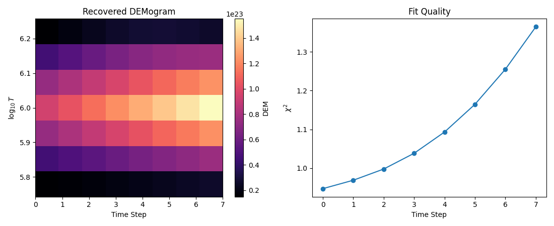
print("DEMogram shape:", dem.shape)
print("Chi-squared range:", float(np.min(chisq)), float(np.max(chisq)))
DEMogram shape: (8, 7)
Chi-squared range: 0.9471411472752927 1.3643443045306782
A DEMogram is easier to trust if it is read together with a fit-quality check. If one part of the sequence has much worse chi-squared than the rest, that often matters as much as the apparent temperature evolution.
fig, axes = plt.subplots(1, 2, figsize=(11, 4.5))

im = axes[0].imshow(
    dem.T,
    origin="lower",
    aspect="auto",
    cmap="magma",
    extent=[0, dem.shape[0] - 1, mlogt[0], mlogt[-1]],
)
axes[0].set_xlabel("Time Step")
axes[0].set_ylabel(r"$\log_{10} T$")
axes[0].set_title("Recovered DEMogram")
fig.colorbar(im, ax=axes[0], label="DEM")

axes[1].plot(chisq, marker="o")
axes[1].set_xlabel("Time Step")
axes[1].set_ylabel(r"$\chi^2$")
axes[1].set_title("Fit Quality")

fig.tight_layout()
plt.show()
Total running time of the script: (0 minutes 0.191 seconds)